지역별 표시(Plotting neighborhoods)
이제 데이터에 탑승 및 하차 지역이라는 또 다른 특성(feature) 집합을 추가합니다. 경도와 위도로부터 지역 정보를 얻는 것은 우리가 쉽게 하드 코딩 할 수 있는 것이 아니기 때문에, 몇 개의 GIS 패키지와 shapefile(courtesy of Zillow)을 사용합니다. shapefile은 지리적 영역을 구분하는 경계에 대한 정보를 포함한 지리 정보가 들어있는 파일입니다. ZillowNeighborhoods-NY.shpfile에는 NYC 지역에 대한 정보가 있습니다.
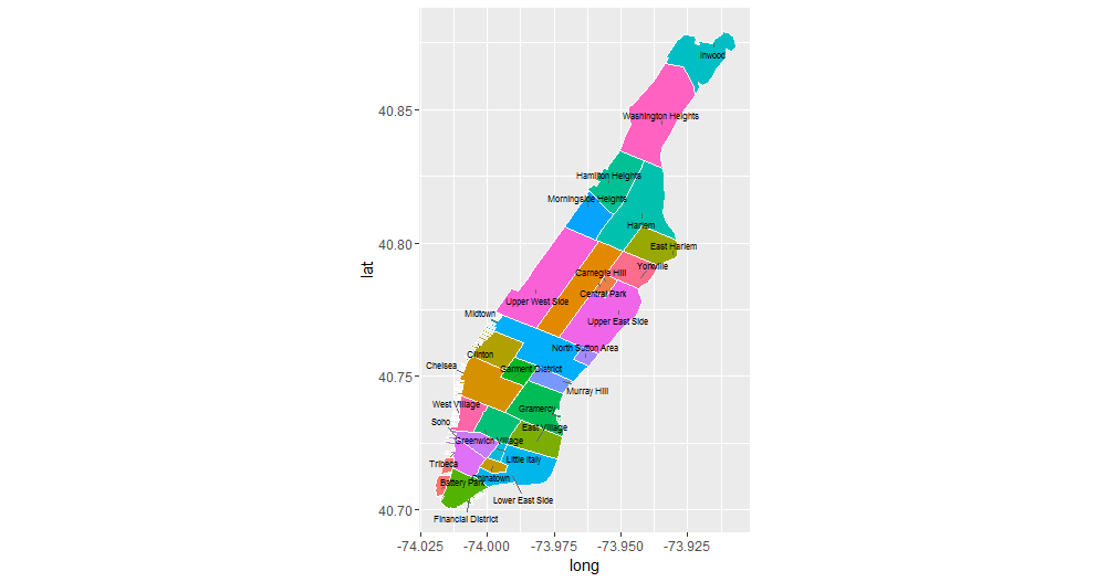
우리는 맨해튼 지역의 지도에 플롯을 그리는 것으로 시작하며, 지역 경계를 확인하고 지역의 이름에 익숙해 지도록 합니다. 아래 플롯이 어떻게 생성되었는지에 대한 자세한 내용은 이 강의의 내용을 넘어서기 때문에, 보다 자세한 내용은 maptools 라이브러리에 대한 설명서를 확인하는 것을 권고 드립니다.
library(rgeos)
library(maptools)

nyc_shapefile <- readShapePoly('ZillowNeighborhoods-NY/ZillowNeighborhoods-NY.shp')
mht_shapefile <- subset(nyc_shapefile, str_detect(CITY, 'New York City-Manhattan'))

mht_shapefile@data$id <- as.character(mht_shapefile@data$NAME)
mht.points <- fortify(gBuffer(mht_shapefile, byid = TRUE, width = 0), region = "NAME")
mht.df <- inner_join(mht.points, mht_shapefile@data, by = "id")

library(dplyr)
mht.cent <- mht.df %>%
  group_by(id) %>%
  summarize(long = median(long), lat = median(lat))

library(ggrepel)
ggplot(mht.df, aes(long, lat, fill = id)) +
  geom_polygon() +
  geom_path(color = "white") +
  coord_equal() +
  theme(legend.position = "none") +
  geom_text_repel(aes(label = id), data = mht.cent, size = 3)